Odds Ratio Plot Odds ratio plot
Odds ratio plot
Odds ratio plot show the odds of an outcome for various risk factors. Both the outcome and the risks must be binary.
For this example, we will look at the odds of dying vs surviving for MERS-CoV patients, by sex, age (> 60 years old) and presence of reported comorbidities. First we must ensure all our variables are binary. We will assume that patients with no reported comorbidities are healthy.
import epipy

df = epipy.get_data('mers_line_list')
df = df[(df['Health status'].isin(['Alive', 'Dead']))]
df['binary_age'] = 0
df['binary_age'][df['Age'] > 60] = 1
df['Reported comorbidities'] = df['Reported comorbidities'].fillna('N')
The or_plot() function must have a dictionary with the order for each variable. The order is yes/no or presence/absence.
outcome_order = {'Sex':['M', 'F'], 'binary_age':[1, 0], 'Reported comorbidities':['Y', 'N']}
fig, ax = epipy.or_plot(df, ['Sex', 'binary_age', 'Reported comorbidities'], 'Health status', outcome_order, ['Dead', 'Alive'])
Significant risk factors are shown in blue. Protective ‘risks’ are shown in red, and nonsignificant risks are in gray. In this example, age > 60 is a risk factor for death. The other two variables are not significant.
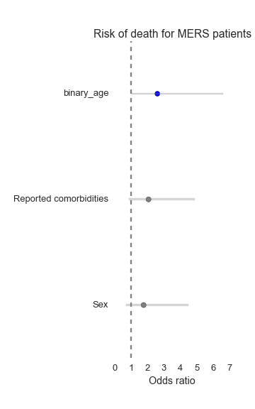
The odds ratio and their 95% confidence interval are also returned for each considered risk.
Sex:
Odds ratio: 1.76 (95% CI: (0.69, 4.5))


binary_age:
Odds ratio: 2.6 (95% CI: (1.02, 6.62))


Reported comorbidities:
Odds ratio: 2.06 (95% CI: (0.86, 4.9))