Rolling Proportion Plot Odds ratio plot
11 May 2015
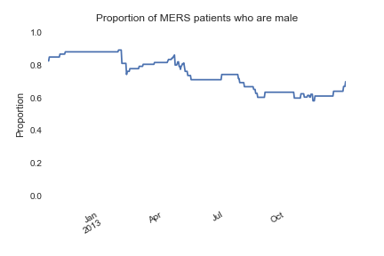
Rolling proportion plots show how the proportion of a binary variable like sex (male, female) has changed over time. This is useful for understanding risk factors and epidemic dynamics over the course of an outbreak. Sparse data is interpolated. You can choose whether to discard or include missing values using the dropna argument.
df = epipy.get_data('mers_line_list')

#Be sure date is in datetime format
df['date'] = df['Approx onset date'].apply(epipy.date_convert)

prop, fig, ax = epipy.rolling_proportion(df, 'date', 'Sex', 'M', fig=fig, ax=ax)
The plot shows that most MERS patients are men, and that the proportion fo patients who are men has been relatively steady over time.
And the function also returns a timeseries of proportions (prop in the example above).
2012-10-10    0.833333
2012-10-11    0.833333
2012-10-12    0.857143
2012-10-13    0.857143
2012-10-14    0.857143