MERS-CoV example
MERS-CoV is a SARS-like coronavirus that emerged in Saudi Arabia in 2012. It is zoonotic, which means it is passed from animals to humans. However, MERS is also capable of limited human to human transmission.
I have been collecting a line list of MERS cases using publicly available data like WHO Disease Outbreak News reports. Where possible, I’ve been trying to piece together human to human clusters - it’s guess-work at best, and I can’t promise it’s anything close to being correct.
The (totally unconfirmed) line list from 2012-Feb 2014 is packaged with epipy.
import epipy as epi
import pandas as pd

mers_df = epi.get_data('mers_line_list')
Line lists are messy. A little data cleaning is needed before we proceed. First we need to convert our two date columns to the proper datetime format. Then I’ll collapse the two, preferring onset date over report date.
mers_df['onset_date'] = mers_df['Approx onset date'].ma (epi.date_convert)
mers_df['report_date'] = mers_df['Approx reporting date'].map(epi.date_convert)
mers_df['dates'] = mers_df['onset_date'].combine_first(mers_df['report_date'])
First we’ll use the Cluster ID column to make a case tree plot. I’ll color each node by its cluster membership, and turn the legend off to prevent crowding. I set the generation time to 5 days and the standard deviation to 4, which is the best guess I can get from the literature.
fig, ax = epi.case_tree_plot(mers_df, cluster_id='Cluster ID', \
                    case_id='Case #', date_col='dates', gen_mean = 5, \
                    gen_sd = 4, color='Cluster ID', legend=False)
ax.set_title('Human clusters of MERS-CoV')
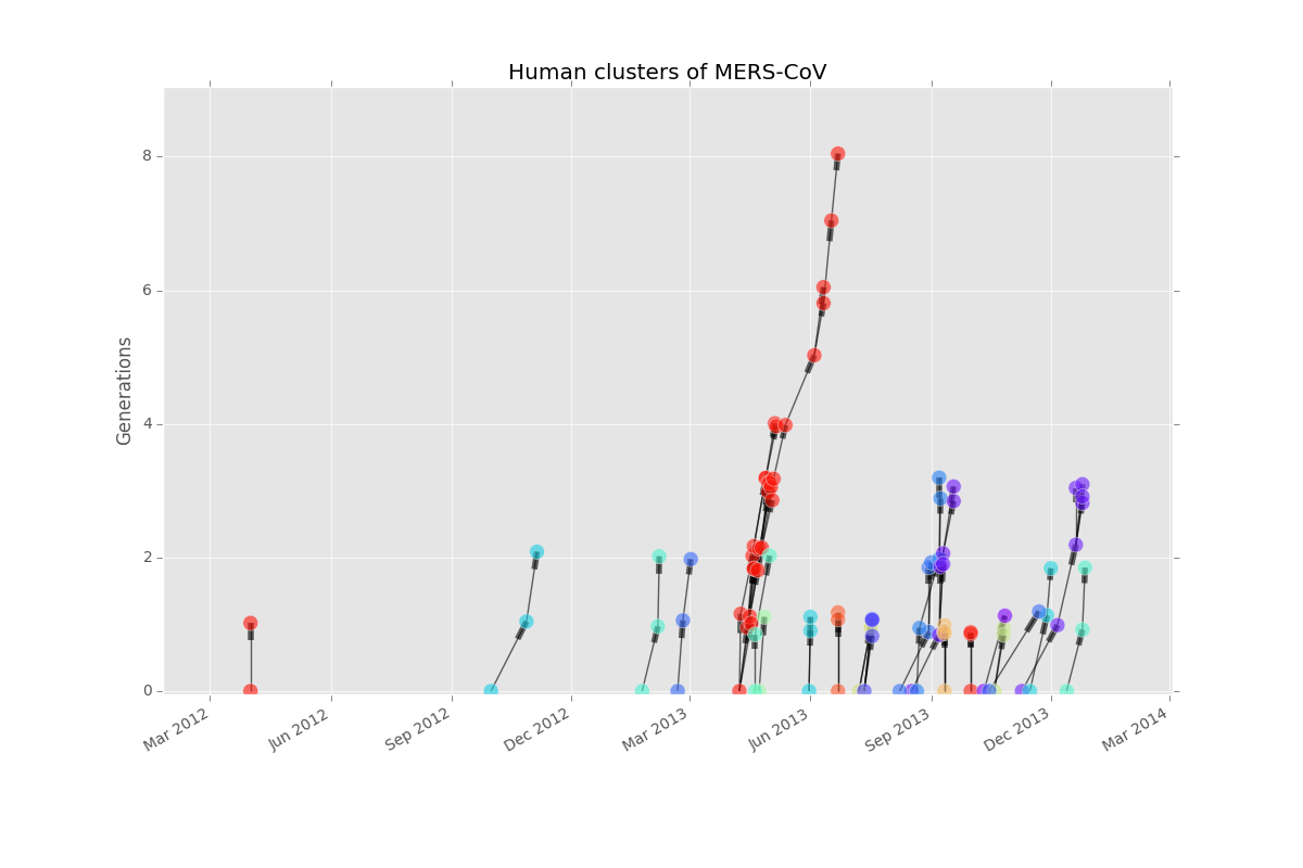
It looks like most clusters get to only one or two generations before dying out. There was clearly a huge spike in cases around April. However, case tree plots only include cases that are part of human clusters. Let’s look at an epicurve, which will include all cases, to learn more.
plt.figure()
curve, fig, ax = epi.epicurve_plot(mers_df, 'dates', freq='month')
plt.title('Approximate onset or report date of MERS cases')
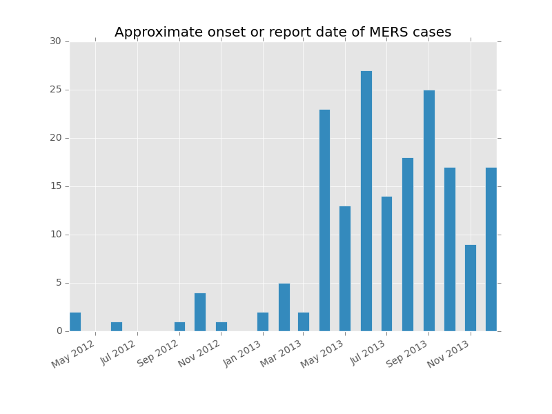
Looks like the number of incident (new) cases has been more or less steady since summer.
Going back to the case tree plot, some of those clusters look hard to parse. I wonder what the distribution of the reproduction numbers looks like? We’ll build a network graph using all the cases (not just ones that are part of human to human clusters), but this time we’ll color the nodes by patient sex so we can use it later.
mers_G = epi.build_graph(mers_df, cluster_id='Cluster ID', case_id='Case #', date_col='dates', color='Sex', gen_mean=5, gen_sd=4)
R, fig, ax = epi.reproduction_number(mers_G, index_cases=True, plot=True)
R.describe()

count    101.000000
mean       1.000000
std        1.296148
min        0.000000
25%        0.000000
50%        0.000000
75%        2.000000
max        5.000000
dtype: float64
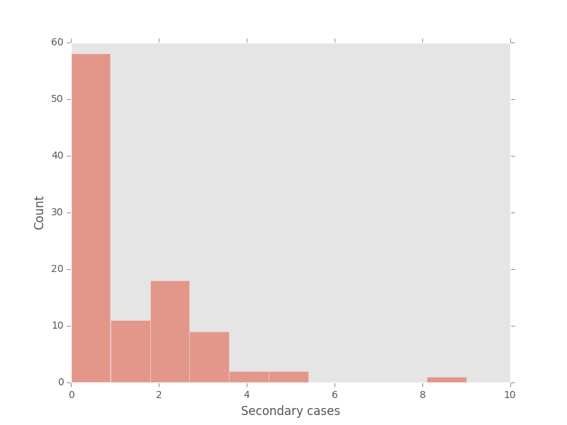
Looks like roughly half of cases produce no secondary cases, and half produce at least one secondary case.
I have heard men might be more at risk for getting severe disease than women. Could it be so? To find out, we’ll need to collapse the values in the Health Status column to Severe and Less Severe. Then we’ll create a 2x2 table to analyze.
mers_df['condensed_health'] = mers_df['Health status'].replace(['Alive', 'Asymptomatic', 'Mild', 'Recovered', 'Reocvered', np.nan], 'Less severe')
mers_df['condensed_health'] = mers_df['condensed_health'].replace(['Dead', 'Critical'], 'Severe')

table = epi.create_2x2(mers_df, 'Sex', 'condensed_health', ['M', 'F'], ['Severe', 'Less severe'])
Returns:
     Severe  Less severe  All
M        71           30  101
F        26           34   60
All     107           78  185
It’s hard to tell just from looking at the table whether men get more severe disease. We need some statistics - like the analyze_2x2 function.
epi.analyze_2x2(table)
Returns:
Odds ratio: 3.09 (95% CI: (1.59, 6.02))
Relative risk: 1.62 (95% CI: (1.18, 2.22))

Chi square: 11.5161253972
p value: 0.0213367053676
Because are greater than 1 (and the confidence intervals do not contain 1), it looks like men are at risk of getting more severe disease. There is a hypothesis that this could be because more men than women are acquiring the disease from animals and that zoonotically acquired disease may be more severe. If true, this finding might suggest that the infection source is something men are in contact with more than women. Could it be true that more index cases are men? We can evaluate using the generation_analysis function. (Allow me to remind you here that the clusters I’ve created are best-guess only. The epidemiological situation on the ground may be totally different than how I’ve constructed it).
fig, ax, table = epi.generation_analysis(mers_G, attribute='Sex', plot=True)
Returns:
Sex by generation
Sex          F   M  All
generation
0            6  14   22
1           16  17   35
2            5  12   20
3            7   6   16
4            1   2    3
5            0   1    1
6            1   1    2
7            0   1    1
8            1   0    1
All         37  54  101
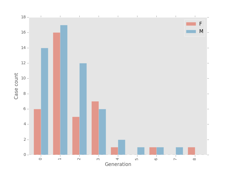
There may be something to that theory after all! Among cases that belong to human clusters, 64% of index nodes are male, and 49% of first generation nodes are male. It goes back up to 60% at generation 2 though so it’s hard to say for sure.