Epicurves Epidemic curves
11 May 2015
Epicurves
What is an epicurve?
Epidemic curves, or epicurves, are a common way to visualize outbreaks. They are plotted as the count of incident (new) cases over time. Traditional epicurves are bar plots, not line plots.
Examples
For these examples we will use data from the MERS-CoV outbreak.
import pandas as pd

mers_df = epipy.get_data('mers_line_list')
curve, fig, ax = epipy.epicurve_plot(mers_df, date_col='dates', freq='month')
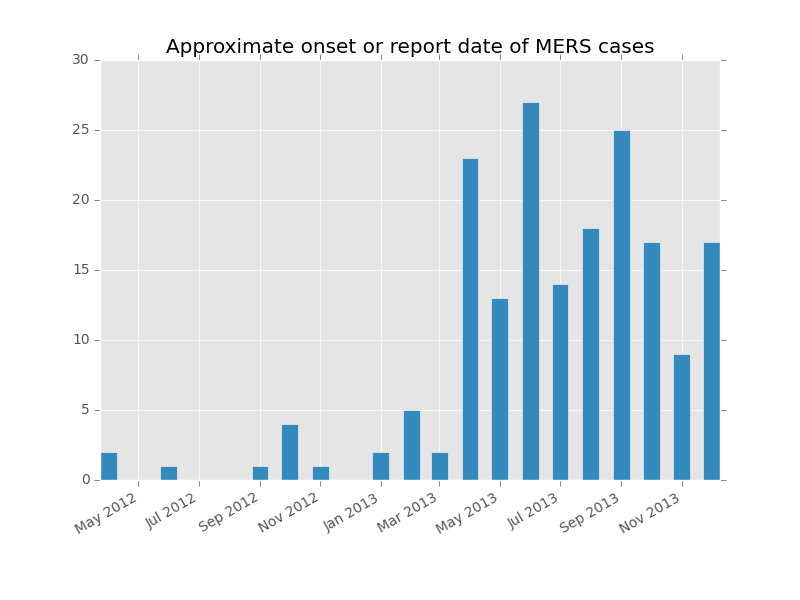
The curve variable returns a table with a list of dates and their frequency. Monthly epicurves work by reassigning all cases for that month to the first day of the month. For the MERS data, it looks like this:
            count           plotdates
2013-06-01     27 2013-06-01 00:00:00
2013-09-01     25 2013-09-01 00:00:00
2013-04-01     23 2013-04-01 00:00:00
2013-08-01     18 2013-08-01 00:00:00
2013-10-01     17 2013-10-01 00:00:00
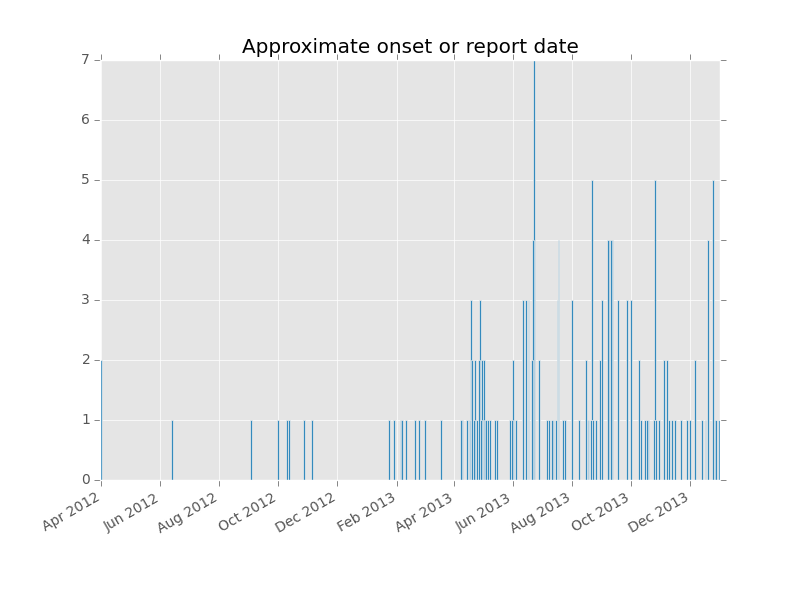
You may also plot the frequency by day, month or year using the freq argument.
curve, fig, ax = epipy.epicurve_plot(mers_df, date_col='dates', freq='day')
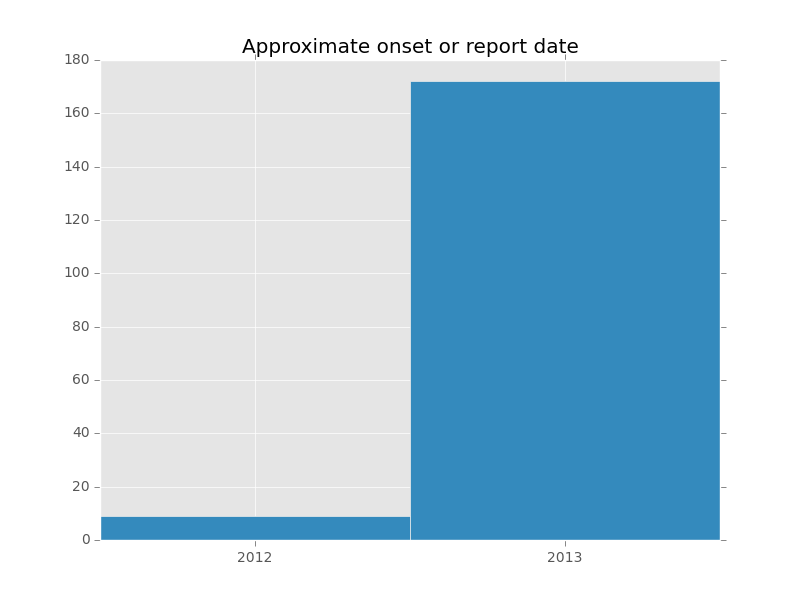
curve, fig, ax = epipy.epicurve_plot(mers_df, date_col='dates', freq='y')