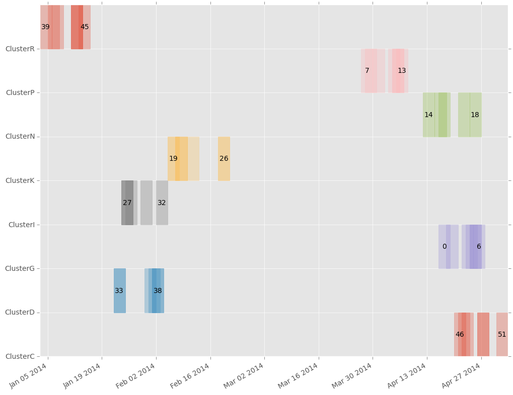
Checkerboard Plot Checkerboard plots
11 May 2015
Checkerboard plot
What is a checkerboard plot?
I developed checkerboard plots to display clusters of disease, similar to a case tree plot. Instead of a network, checkerboard plots show a simple time series for each cluster, with each case as a box. It does not attempt to determine the structure of the transmission network.
Examples
First, load in the example data packaged with epipy. Then simply call the checkerboard() function with column labels that correspond to columns containing unique case id numbers, cluster membership, and the date of illness onset or report. The label argument is optional; if set to off, no case id numbers will be displayed.
import epipy
import pandas as pd

df = epipy.get_data('example_data')
fig, ax = epi.checkerboard_plot(df, case_id='ID', cluster_id='Cluster', \
          date_col='Date', labels='on')
ax.set_title('Example outbreak data')